
As a marketing technologist, I’m often trying find a dashboard view for my websites where I can also track marketing data. Some of these reports can be fairly comprehensive, especially when I build a dashboard for a single site.
Updated: May 5, 2025
I also have some simple dashboards that allow me to get an instant snapshot for multiple sites. As I write this, I have over 250 websites that I manage with about 2/3 of those being client sites and the rest falling under personal projects.
Managing these sites in general takes a lot of resources, but a I have a solid team behind me. I also automate a lot of my data collection and display.
Today I bring you a simple dashboard built with Google Data Studio for monitoring multiple websites. I have two versions of this dashboard, the first which is a live snapshot of Today, in near real time. The other, is a duplicate of the daily report, but with time frame set to Yesterday’s Full Day data. I’ll address the second report at the end.
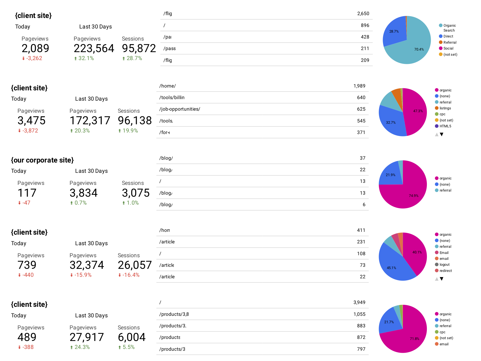
Here’s my Daily Domain Report (Client and some URL data has been redacted for privacy):
When building a dashboard with multiple websites, it’s important to slim down the metrics you are analyzing otherwise it is easy to get lost in the weeds with too much data. In my case I consider this a quick gauge on the health of a website (this isn’t a replacement for website uptime/downtime monitoring). I’ll break the three columns of data for you.
Pageview Metrics
Look at the first column of pageview metrics, I track three data points. Today’s Pageviews (with a comparison to yesterday below it). Last 30 Days Pageviews (with comparison to prior 30 days) and Last 30 Days User Sessions (with comparison to prior 30 days). While the comparison of today’s pageviews to yesterday’s pageviews almost always be down (partial day vs. full day) I can be alerted to some major traffic events.
For instance, if it is 1:00pm and the site usually gets 5000 pageviews/day and I’m only at 20 so far today, something very wrong has happened. And conversely, if it reporting much more than it should be at that time of days, I can alert relevant contacts or team members that we may have an immediate/actionable traffic event taking place (is there an opportunity for crafting a quick offer, new blog post, can we generate some PR, etc.).
The Pageviews and Sessions for the last 30 days are there as both a benchmark for user sessions and pageviews (are they increasing or decreasing in overall).
Top Pages Metric
The middle column shows that top traffic pages from Yesterday.
This is primarily a vanity metric on this Daily Domain Dashboard, but occasionally it can provide some actionable data – for instance, are we seeing an internal search result page showing up, is this some we can write an FAQ piece for, or a new blog post. Or if we start to see our custom 404 error page show up, do we have site problems going on. Sometimes, we’ll see that some content pages are receiving more pageviews than our homepage, this is then something we can move in to actionable data. Maybe we will start A/B testing headlines or calls-to-action on these pages. Maybe this is a subject we should expand upon in the future and add it to the content calendar for our content marketing efforts.
Visitor Acquisition Channels
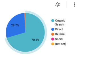
Again, as a marketing technologist, I’m often juggling SEO and PPC efforts. This third column is a snapshot of user acquisition over the last 30 days. This is just gauging the health of a website. We’ll often want to make sure we have a health mix of referral channels, whether it be organic search traffic, social traffic, PPC, etc.
I have played around with the time frame on this chart in the past. Currently it is 30 days for most of our websites. However I may shorten up the time frame on this pie chart if we have launched a new site, started a very large campaign for a client, or onboarded a new client and don’t have a lot of historical data from their existing analytics. In some of those cases, I may drop it to as low as the last seven days.
Multiple Sites Per Page
My personal preference is to display 5 sites per page and no more than 20 sites per dashboard report. 5 per page fills up an 8.5×11 sheet of paper just right and is perfect for reporting. Since we have multiple salespeople and account teams, I tend to group these around the specific sites they are responsible for.
Automating the Reporting
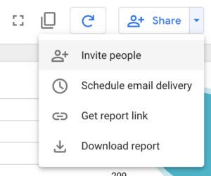
Recently, Google DataStudio added the option to schedule email reports. Before they added that function, I used three different methods to get them. Early on, I or another team member would take 15 minutes out of our day to download them. Then I spent way too much time getting wrapped around the axle trying to automate the process with both AppleScript and Shortcuts. I finally settled on having a virtual assistant (VA) do this daily for around $80 a month. It was well worth the cost. But now we have scheduled email delivery, so that’ where this automation now lies.
Each report can only have a single Schedule delivery option. I like to think we run a very efficient shop and are pretty proactive with our clients. While I could jump in to these reports all day long, I need to keep my attention focused. So I’ll schedule these dashboard to email me (and relevant team members) these dashboard reports every day at 1:00pm. Some of the account staff will look at them and see some actionable information, some don’t. It isn’t designed to be a mandatory task, but when we are onboarding a new project or rolling out a new campaign, we can get some quick trends without having to go out to different analytics sources.
Now, since these reports can be scheduled, this is the reason why I’ll duplicate this Daily Domain Report with a second called Yesterday’s Domain Report. I reset all of Today’s data points to yesterday, save the report and Schedule to my inbox every morning at 8:00am. Then using some inbox automation tools, it will save out the PDF that is delivered with the automated report, save it out to a cloud storage location and rename it with our group code and YYYYMMDD date stamp (for example: GRP1-20200128.pdf) for archiving. It will then remove it from my inbox so I never see it. This is a new workflow and was only made possible by the Scheduled Email function being added. It was too time consuming for us to do this daily and too expensive for a VA to do it.
But now that Schedule Email Delivery function is here, I consider it is a best practice to archive these daily reports – especially with how inexpensive cloud storage is these days. Sure, we haven’t had too many times where we have gone back and looked at these reports because we do have Google Analytics for advanced investigation, but we have referred to these and included them in white papers and our motion graphics guy has also done some cool onion-skin animations of the visitor acquisition pie chart. I may change my mind down the road and only go to weekly or monthly snapshots if it becomes too cumbersome, but for now, we have them available if we need them.
Want to build your own Daily Domain Dashboard like this? All you need is a website with Google Analytics tracking. Jump into Google Data Studio, set up connector to your Google Analytics Account and start adding the boxes. It is pretty intuitive, but I won’t throw you to the wolves just yet.